2019 Rebrand: Designing the new identity
BBVA is at a pivotal point of digital transformation bringing the age of opportunity to everyone. This deserves an identity that reflects our commitment to innovation, our unified position in the marketplace, and the promise we offer to our customers.

Understanding the past to create a brighter future
The BBVA Design team started designing the new identity by understanding the history of our logo. Our brand has a rich visual history having created new identities as it grew from a local Spanish bank into a global brand. The unique “B” and “V” shapes were drawn in 1988.

Building on existing strengths
BBVA has developed immense brand equity in its four letters as well as the blue corporate color. We wanted to build on top of these core elements.
The four letters B, B, V, A are uniquely ours and the color blue has been our primary color since 1969, when the Banco de Bilbao logo was first designed.
Key decisions that influenced the final design
Three important decisions were made at the beginning of the project that set the tone and direction of the overall identity.
- THIS SHOULD FEEL LIKE A REVOLUTION, NOT AN EVOLUTION
We wanted this new identity to feel consequential—consequential budgets should have positive consequences.
- INVEST IN OUR WORDMARK, NOT A NEW SYMBOL
We wanted to build on our existing strengths. The four letters B, B, V, A are uniquely ours and recognizable around the world.
- WE WANT THIS TO SYMBOLIZE OPPORTUNITY
In all of our countries, the most common idea of opportunity is the concept of prosperity—elevating one’s life to achieve a better, more comfortable level of living.
The most common idea of opportunity is prosperity–elevating one’s life to achieve a better, more comfortable level of living.
Creating the logo
A team of four internal BBVA designers from our different country design teams collaborated with our partners at Landor London to explore different logo proposals and ultimately design the final logo together in our studio in Madrid.

The BBVA Design team designing the logo in our Plaza Santa Bárbara studio.
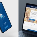
The new logo in use
The logo was designed with a digital-first approach to maintain the stregth of the letters at any size.

Creating a design system to compliment the new identity
To emphasize the ideas of opportunity and ascension, we infused two concepts into every decision across the design system. Light: the promise of new opportunity and growth. Elevation: the ability to ascend and prosper in life.

Light and elevation are two concepts infused into all design desicions.
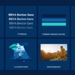
The Design System
Our brand is made up of 8 core visual elements.
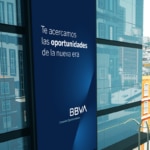
The Lightstream
Soaring ambition. Embracing exponential technology to make banking better for our customers. Dramatising the trajectory of an opportunity being realized, we created a dynamic asset that acts as a beacon of aspiration, of what we hold true for our customers and for ourselves.

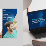
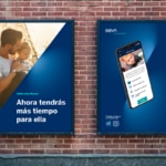
Photography
Capturing evocative light at the ‘golden hour’ of the morning, and exaggerating our brand colours within elements of the imagery, we capture the anticipation of a new day and create a unique, ownable image style.
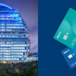
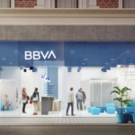
The new BBVA design system
A flexible system that carves out a distinct place for BBVA in the market and drives a positive emotional reaction.